Analysis of causes of deaths reported by CDC from 2014–2021
Introduction
COVID-19 (Coronavirus) appeared as the official cause of death reported by CDC in January 2020, with 3 deaths that indicated COVID as underlying cause of Death. Explanation of what underlying cause of deaths related to COVID-19 is, can be found in WHO guidelines as per Appendix 2, in point 2.1.
At the time the virus appeared, it was not exactly known what it is and how it spreads. Scientists started working to understand the virus and ways to protect the public. Initially, public was told to keep proper physical distance from each other, then it was said that wearing masks in public places is effective to limit spread of the virus. Additional restrictions by the governments were designed to also limit the spread of the virus, and those included closing crowded stores and entertainment venues as well as sporting events.
By the mid 2021, most of developed countries had access to vaccines, a lot more information was known about the virus and most developed countries learned how to live with it. The only problem is that viruses can mutate and this is what was happening with this virus too. The most knows mutations were delta and omicron, which caused panic. Public considered those new strains as new viruses as each of them had different effect on the body. Again as more information got revealed, people got more comfortable and felt safer.
Hidden effects of the pandemic
Virus itself is dangerous and can cause a loss of life directly and that is what official statistics report. Actions taken by governments that limit the spread of the virus, although very crucial in the fight with the virus, can also cause harm and loss of life indirectly. We are going to look more closely at the data available from CDC to understand it more and uncover hidden meaning of the data and hidden cost of fight with the pandemic.
First look at the data
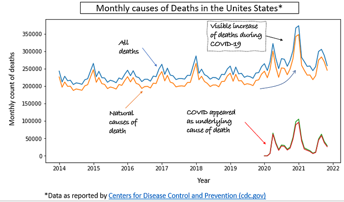
When we first look at the data in Figure 1, it looks familiar and what we would expect. In the initial part of the trend before COVID virus, the data is cyclical, with number of deaths increasing during the winter season and decreasing during the summer season. When COVID appeared in the statistics, we can see that cyclical behaviours changed a little due to COVID “waves” of the pandemic. This is what we would expect from the data and nothing surprising.

To understand data more in detail, we look at other causes, to be sure we know what are the main drivers causing this loss of life. It turns out that the deaths causes do not sum up to the total, with some of the deaths having few causes, even with Natural causes present.
COVID pandemic started in 2020 in the USA and at this time first deaths due to COVID have been reported. We will look at the whole dataset available to understand causes of death during these 8 years as well as comparing a period before and after pandemic started.
Main causes of deaths are presented on the bar chart in Figure 2. They are averages for the whole data set and include COVID-19 which was not the cause until 2020. Data does not included Natural causes as they can be a combination of many different causes and do not add too much value to the analysis, as we have seen in Figure 1, that natural causes increase even during COVID, which is hard to understand.

If we want to understand what fraction of all deaths during 2020/2021 are related to COVID-19 we can chart percent of total deaths that are reported as caused by COVID-19. This data is presented in Figure 3. From this chart we can see that deaths from the virus as pretty cyclical due to pandemic “waves”, which means that number of casualties change a lot from month to month. Looks like there were 3 periods where virus related deaths have been reaching 20–25% of the total number of deaths. In the period with less amount of deaths due to COVID, the numbers were falling down to 5–10%.

With the high number of deaths as presented in Figure 3, we want to understand if statistics are affected by the COVID deaths and if too much or too little deaths are assigned to the virus. This is a risk as sometimes people die and they could have been infected with the virus but never got tested for COVID. On the other hand it is easy to just throw all the data under the “umbrella” of COVID, even if people had underlying conditions that led to the death.
Taking this into account, we chart (Figure 4) number of deaths per month with and without deaths that are associated with COVID. Although the exercise was done to check if there would have been a statistical significance of deaths increase or decrease without COVID deaths into picture, the data variability before COVID does not allow to prove that there would have been any difference. This data looks quite normal with number of deaths without COVID included to be still following previous trend and variability. With this out of the way we can look at more information and consider this data to be quite normal.

More detailed look at the data
Number or deaths increases during the winter period, during which reported deaths are in generally higher due to flu season and other diseases. During the summer, there is an increase in deaths due to car accidents and homicide. Examples of those trends are below in Figure 5.


From Figure 5. The interesting is the fact that deaths due to heart diseases increase shortly after COVID-19 was being reported as the underlying cause of death. Since this is interesting fact, we are going to find all causes of death that appear to increase or decrease in the middle of 2020 and check if this is statistically significant difference from before and after year 2020.
Closer look at the pandemic related deaths

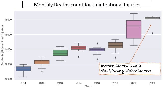
Next is the check if any of those factors is significant enough to consider different from before pandemic. We will use box plot trend for this to visually assess if data is different. Two causes show statistical significance, which are Unintentional injuries and Drug Overdose, while Diabetes Mellitus is not statistically significant. This is shown in Figure 7.


In addition to presented two causes of deaths, there is one more showing statistical significance, but is not so high comparing to other ones. These are deaths related to Homicide as shown in Figure 8. Although not as big in comparison to other ones, but is important factor to mention as this is the other one (in addition to drug overdose deaths) that is truly a hidden cause of the pandemic isolation and stress related to it.

Summary
Data presented in this article shows that there are hidden effects of the pandemic and COVID-19 that on the large scale are hard to notice, but they are directly related to pandemic isolation and change in the way of life for many. It shows indirectly that use of drugs and the number of homicides have increases which is indicated by significantly higher number of deaths related to those causes.
Surprised? Leave a comment below or read my other articles here.
Appendix 1. Details on data preparation for the analysis
See the GITHUB repository with the Jupyter notebook that shows steps of data preparation:
Data organization and cleaning included the following steps:
1) Data sets used for analysis are described in Appendix 2, with all sources.
2) Data was loaded from available .csv files into Pandas Dataframe.
3) Both data sets (1.1 and 1.2) were combined to have one data frame with all years including COVID years (2020/2021).
4) Cleaning of the data included the following (described in detail in Jupyter notebook in GITHUB repository linked here.)
a. Removing unnecessary columns
b. Adding date column and formatting it as date column for sorting and charting
c. Additional calculations and columns addition for further analysis
5) After cleaning the data I created some trends to show the meaning of the data and described what I found.
Note: Data from some sources used Is indicated as provisional, but purpose of this exercise is to practice, so data was taken for analysis as is. Any conclusion based on this data may not be correct, if data is not final.
Appendix 2. Data Sources and other resources available online.
All data found through USA government publicly available data: Data.gov, redirected to databases from Centre for Disease Control and Prevention, as per below:
1. Monthly Data used for analysis
2. Other data used for reference.
2.1. Guidelines by WHO on classification of COVID death: Guidelines_Cause_of_Death_COVID-19.pdf (who.int)
