How to Create Matplotlib Trends in Python
In 10 short steps create useful trends in Matplotlib.
‘It’s easier than you think …’
This short step by step guide is to allow anyone to create useful trends in Matplotlib
Note: This guide can be used as a reference or learning tool. Installation is not the topic so external links are posted.
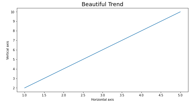
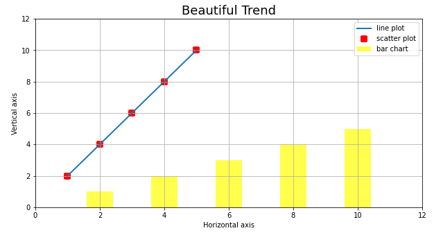
We are going to create a beautiful chart, like the one below:

Step 0:
Installing Matplotlib and Jupyter.
It is not so scary, just get Anaconda or start editor online, below are the options:
Explained in installation guide:
- From real Python, few options: https://realpython.com/pandas-plot-python/#set-up-your-environment
- From Matplotlib, one option: https://matplotlib.org/stable/users/installing/index.html
Step 1:
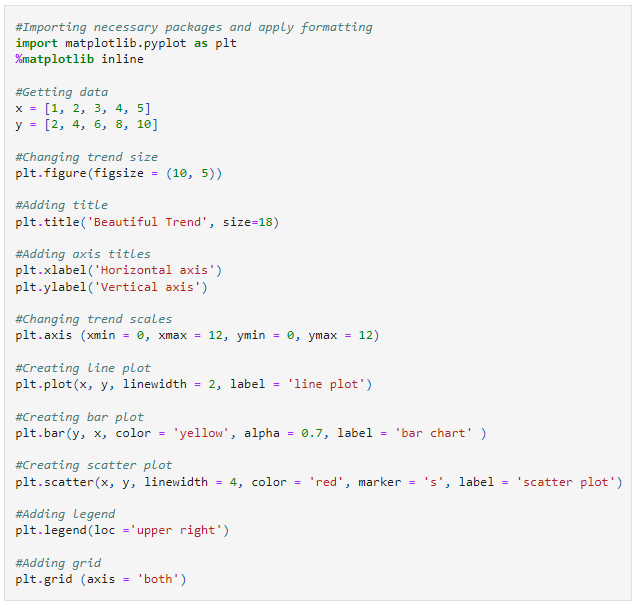
Importing necessary packages and apply formatting.
- Matplotlib
Step 2:
Getting the data:
- Creating own data

Notes:
- It is possible to use the pandas Dataframe to get data to trend.
- It is possible to use the NumPy library to create data automatically.
Step 3:
Making a plot:


Step 4:
Making trend bigger:


Step 5:
Adding title:


Step 6:
Adding axis titles:
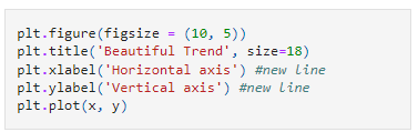
Step 7:
Adjusting trend scales:
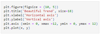

Step 8:
Adding more trend types and trend formatting:
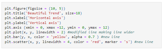
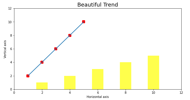
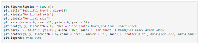
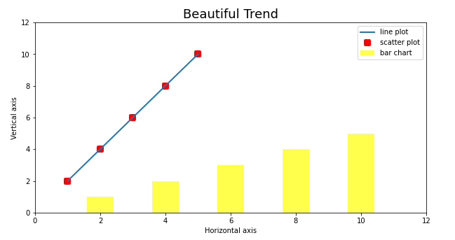
Step 9:
Adding trend labels and legend:
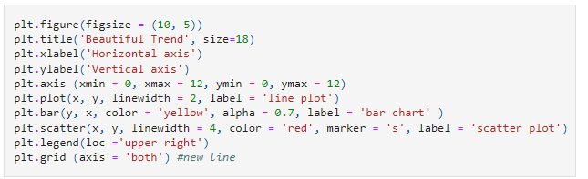
Step 10:
Adding grids:
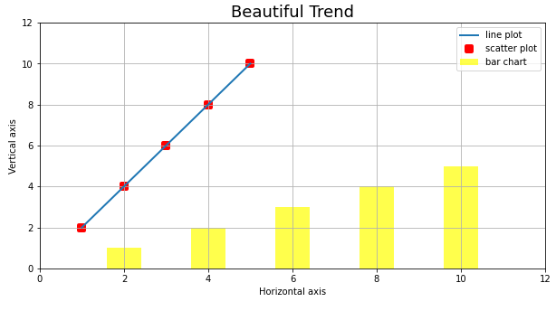
Putting It All Together
Feel free to modify any of the parameters below to see what happens, add your own data, adjust formatting, add more trends, etc.
Use linked Jupyter notebook:
Matplotlib-charts/Matplotlib guide.ipynb at main · kusmat/Matplotlib-charts · GitHub
Get handout here: https://github.com/kusmat/Matplotlib-charts/blob/5caf5f3f80585d1ce8aea378942114ac3fa7b568/Matplotlib%20charts%20-%20Handout.pdf
Like what you see? Want more? Visit my webpage: www.kusmat.com
More content at plainenglish.io. Sign up for our free weekly newsletter. Get exclusive access to writing opportunities and advice in our community Discord.